Key Takeaways
- Use warm whites and earthy neutrals to create a flexible base that works with many decorating styles.
- Add personality with soft greens, deep blues, terracotta, or other muted colors rather than overwhelming the entire kitchen.
- Combine painted cabinets with natural wood to bring warmth, texture, and visual balance into the space.
- Consider two-tone cabinets to create contrast while keeping the overall color palette simple and coordinated.
- Use backsplashes, wall paint, hardware, rugs, and lighting to experiment with trends without making expensive permanent changes.
- Test color and material samples in your kitchen because natural and artificial lighting can significantly change their appearance.
- Consider durability, cleaning needs, and maintenance when selecting colors and finishes for frequently used surfaces.
Choosing colors for a kitchen can feel like a big decision. Cabinets, walls, countertops, floors, and backsplashes cover large areas, so even one color choice can change the entire look of the room. The challenge becomes even greater when you want a kitchen that feels current without looking outdated in a few years.
Fortunately, many popular kitchen colors are flexible enough to work with different decorating styles. Warm whites can complement traditional and modern kitchens. Natural greens can fit farmhouse, cottage, and contemporary spaces. Deep blues can create contrast without limiting you to one design theme.
The key is to use trends in ways that are easy to live with. Instead of choosing every surface based on what is popular today, create a simple base and introduce stronger colors through selected features. This gives you more freedom to update the room later.
Whether you are planning a full remodel or simply refreshing your existing kitchen, these color ideas can help you create a space that feels stylish, comfortable, and adaptable.
1. Warm White Creates a Flexible Starting Point
White kitchens have been popular for years, but warmer shades are becoming a useful alternative to bright, cool whites. Cream, ivory, and soft off-white tones can make a kitchen feel welcoming without becoming too dark.
Warm white works with many decorating styles because it acts as a neutral background. In a traditional kitchen, it can complement wood floors and classic cabinet details. In a modern room, warm white can soften clean lines and simple surfaces.
The color also pairs well with many materials. Natural stone, butcher block, stainless steel, brass, black hardware, and colorful tile can all work against a warm white background.
Before choosing a shade, test samples in the actual kitchen. Natural and artificial lighting can change how paint appears throughout the day. A color that looks creamy in a store may appear yellow or gray in your home.
If you want a simple update without replacing cabinets or counters, warm white walls can provide an easy starting point.
2. Soft Green Brings Nature Indoors
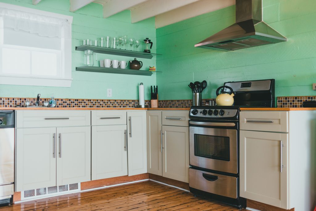
Green has become a popular choice for kitchens because it can provide color while still feeling connected to nature. Softer shades are especially versatile.
Sage, muted olive, and gray-green tones can work with wood, stone, metal, and neutral surfaces. They may appear traditional when paired with detailed cabinetry or more modern when used with simple cabinet fronts and minimal hardware.
Green can be introduced in several ways. Painting an island creates a focal point without covering the entire room. Lower cabinets can also be green while upper cabinets remain neutral.
For an even smaller change, use green through wall paint, bar stools, window treatments, or accessories.
Consider the undertone of nearby surfaces before choosing a shade. A green that works well with warm oak may look different beside a cool gray countertop.
Keeping surrounding colors simple allows the green to stand out without making the room feel overly busy.
3. Deep Blue Adds Controlled Contrast
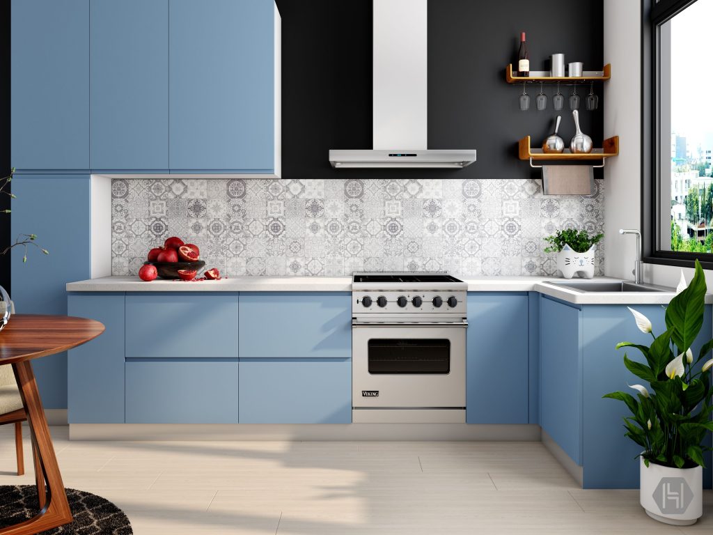
Deep blue can create a strong visual effect without being as severe as black. Navy, slate blue, and other muted dark blues work well in many kitchens.
One popular approach is using blue on a kitchen island while keeping the rest of the cabinets light. This creates contrast and helps define the center of the room.
Dark blue cabinets can also work throughout the kitchen, especially when the room receives enough light. Lighter countertops and backsplashes can keep the space from feeling too heavy.
Before making major color decisions, include paint, cabinet finishes, counters, flooring, hardware, and lighting in your kitchen renovation checklist. Looking at these elements together can prevent you from selecting a cabinet color that clashes with another permanent surface.
If you are unsure about committing to dark blue cabinetry, start with paint or smaller features. A blue accent wall or piece of furniture can provide a similar effect and is easier to change later.
4. Natural Wood Tones Add Warmth
Not every kitchen color trend comes from paint. Natural wood tones can bring warmth and texture into a room while working with many decorating styles.
Light and medium wood finishes can complement modern, Scandinavian-inspired, farmhouse, transitional, and traditional interiors. Darker wood can create a richer and more formal appearance.
You do not need an entirely wood-covered kitchen to use this trend. Wood can appear on an island, open shelving, cabinet interiors, flooring, or furniture.
Combining painted cabinets with natural wood can also create balance. For example, warm white cabinets may look more relaxed when paired with a wood island.
Try to avoid combining too many unrelated wood tones in a small space. They do not need to match exactly, but their undertones should feel connected.
Remember that natural materials can change in appearance over time. Sunlight, age, and finishing products may affect the color of wood, so consider how the material will look beyond the day it is installed.
5. Earthy Neutrals Make Kitchens Feel Softer
Gray dominated home interiors for many years, but warmer neutrals have become increasingly common. Beige, taupe, mushroom, sand, and greige can make kitchens feel softer and more comfortable.
These shades are useful because they provide more depth than white without becoming strong accent colors.
Earthy neutrals can work particularly well on cabinets. A soft taupe cabinet can pair with light countertops, natural wood, and either dark or warm metallic hardware.
Walls are another easy place to use these colors. If your kitchen has white cabinets that feel too cool, a warmer neutral wall color may help balance the room.
Pay attention to undertones. Some beige colors lean yellow, while others contain gray, pink, or green. Compare samples with your existing cabinets, flooring, backsplash, and countertops.
A successful neutral palette is not necessarily made from identical colors. Small differences in tone and texture can keep the room from feeling flat.
6. Black Works Best as a Purposeful Accent
Black can make a kitchen look polished and provide definition, but you do not need large amounts of it to create an impact.
Cabinet handles, faucets, pendant lights, window frames, and bar stools are simple places to introduce black. These details can help connect other elements throughout the room.
Black can also work on an island or a small section of cabinetry. When paired with light walls and countertops, it creates contrast without dominating the entire kitchen.
Before adding dark finishes, consider the amount of natural and artificial light available. A small kitchen with limited light may feel heavier when too many large surfaces are black.
Also remember that some dark finishes show fingerprints, dust, water spots, or grease more easily than lighter surfaces. Consider maintenance when selecting materials.
Used in moderation, black can complement industrial, farmhouse, contemporary, traditional, and transitional kitchens.
7. Muted Terracotta Adds Warm Character
Warm earthy colors are another way to make a kitchen feel inviting. Terracotta, clay, rust, and muted reddish-brown shades can add character without relying on bright colors.
These tones work especially well with warm white, cream, natural wood, and certain green shades. They can also complement stone and handmade-looking tile.
Because terracotta can be visually strong, consider introducing it through smaller areas first. A backsplash, painted wall, decorative tile, or a few accessories may provide enough warmth.
The surrounding materials will influence how the color feels. Paired with rustic wood, it may create a relaxed Mediterranean or farmhouse appearance. Combined with clean cabinets and simple fixtures, it can feel more contemporary.
If you enjoy changing your decor frequently, use stronger earthy colors on surfaces that are easier to repaint or replace rather than expensive permanent features.
8. Two-Tone Cabinets Create Visual Variety
Using two cabinet colors can make a kitchen more interesting without requiring a complicated color scheme.
A common approach is to keep upper cabinets light and use a darker color below. Another option is to make the island different from the cabinets along the walls.
For example, warm white upper cabinets can pair with sage, navy, taupe, or natural wood lower cabinets. The lighter color keeps the upper part of the room open, while the darker tone provides visual weight closer to the floor.
Try to keep the rest of the palette controlled. Too many competing colors across cabinets, counters, backsplash, flooring, and walls can make the room feel disconnected.
Two-tone designs work best when the colors have a clear relationship. Test samples next to one another and view them with the countertop and flooring before making a final decision.
This approach also allows you to use a stronger color without committing to it across every cabinet.
9. Countertop Colors Can Anchor the Room
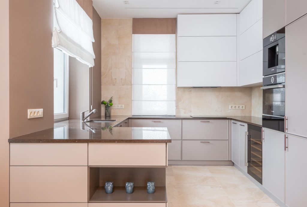
Cabinet and wall colors often receive the most attention, but countertops are an important part of the overall palette.
Light countertops can brighten a kitchen and provide contrast against dark cabinets. Medium or darker surfaces can create depth when paired with lighter cabinetry.
Instead of choosing a countertop based only on a small sample, look at a larger section whenever possible. Stone and stone-look materials can contain veining and color variations that are difficult to understand from a tiny piece.
Also consider durability and maintenance. A beautiful color will not feel like a good choice if the material does not suit the way your household uses the kitchen.
Before replacing counters for appearance alone, make sure more serious problems elsewhere in the home are already addressed. Urgent home repairs involving leaks, electrical concerns, structural damage, or other safety issues generally deserve attention before cosmetic improvements.
Once necessary work is under control, you can focus more confidently on decorative updates.
10. Backsplash Colors Offer Room to Experiment
A backsplash is a useful place to introduce color because it usually covers less space than cabinets or flooring.
Classic white or cream tile can create a flexible background, while muted green, blue, or earthy tile can add personality. Even a simple neutral backsplash can become interesting through texture, shape, or grout choices.
Think about how the backsplash connects the cabinets and countertops. It sits directly between these surfaces, so all three should look intentional together.
If the countertops already have bold veining or patterns, a simpler backsplash may create better balance. If the counters are quiet and solid, the backsplash can carry more visual detail.
Avoid choosing a backsplash in isolation. Bring samples home and view them under your kitchen lighting.
Trends can be useful for inspiration, but choose a material you will still enjoy after the current style changes.
11. Small Color Updates Can Refresh a Kitchen for Less
You do not need to remodel the entire kitchen to experiment with current colors.
Wall paint is one of the easiest options. Changing the walls from cool gray to warm white, beige, or soft green can alter the mood of the room without changing permanent surfaces.
Bar stools, rugs, curtains, artwork, and small furniture can introduce new colors at a lower cost. Even replacing cabinet hardware or light fixtures may help update the overall palette.
These smaller changes are especially useful when your cabinets, counters, and flooring are still in good condition.
They also make future updates easier. If you become tired of a particular color, replacing a rug or repainting a wall costs much less than installing new cabinets.
Using trends through flexible elements can help your kitchen feel current while protecting the investment you have already made in larger features.
12. Choose Colors With Long-Term Maintenance in Mind
Color choices should support more than appearance. Think about how surfaces will age, how easy they are to clean, and whether individual elements can be repaired or updated later.
Very light surfaces may reveal stains, while very dark finishes can show dust, fingerprints, and water spots. Highly textured materials may require more effort to clean than smooth ones.
Durability matters too. Cabinets, counters, floors, and backsplashes receive frequent use, so finishes should be suitable for kitchen conditions.
Thinking about color as part of long-term property care can help you choose materials that remain practical as well as attractive. A finish that looks beautiful but requires constant special treatment may not be ideal for a busy household.
Before making permanent changes, ask how the material should be cleaned, whether it can be repaired, and how its appearance may change with age.
A kitchen is easier to enjoy when its design fits both your style and your maintenance routine.
Conclusion
Kitchen color trends can provide inspiration without forcing you to redesign your entire decorating style. Warm whites, soft greens, deep blues, natural wood, earthy neutrals, and controlled dark accents can all work across a wide range of interiors.
The most flexible kitchens usually begin with a balanced foundation. Permanent features such as cabinets, counters, and flooring should work together, while stronger colors can be added through islands, backsplashes, paint, lighting, and accessories.
Always test colors in your own kitchen before making a final choice. Lighting, nearby materials, and room size can change how a color appears. Samples that look perfect online or in a showroom may look very different at home.
It is also important to balance trends with practicality. Consider cleaning, durability, maintenance, and how difficult a surface will be to change later. You do not need to follow every new design trend to create a kitchen that feels updated.
By choosing adaptable colors and introducing bolder shades carefully, you can create a kitchen that feels fresh today while remaining comfortable and attractive as decorating styles continue to change.
 How to Plan and Manage a Seamless Kitchen Remodel
  The First-Time Homeowners Repair Toolkit: Essential Tools and Fixes Everyone Should Know
  Home Hacks for Consistent Maintenance and Fewer Costly Repairs
  Step-by-Step Kitchen Remodel Guide for Beginners
  Strengthen Family Bonds with These 10 Home Redesign Tips
  Kitchen Color Trends That Work With Any Decorating Style
  How Planned Home Repairs Can Extend Property Lifespan
  Essential Home Repairs You Should Never Delay